Just in time for Halloween, my team created a campaign using four films that warn about the dangers of data collection, facial recognition, and social media apps. We wove these into a horror-like trailer that gets the audience to think: what if truth is scarier than fiction?
TYPE PLAY
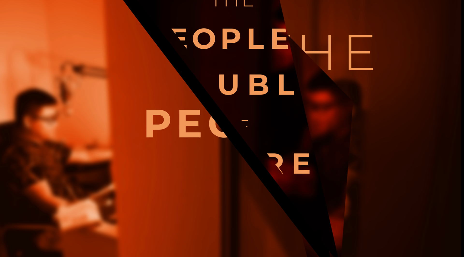
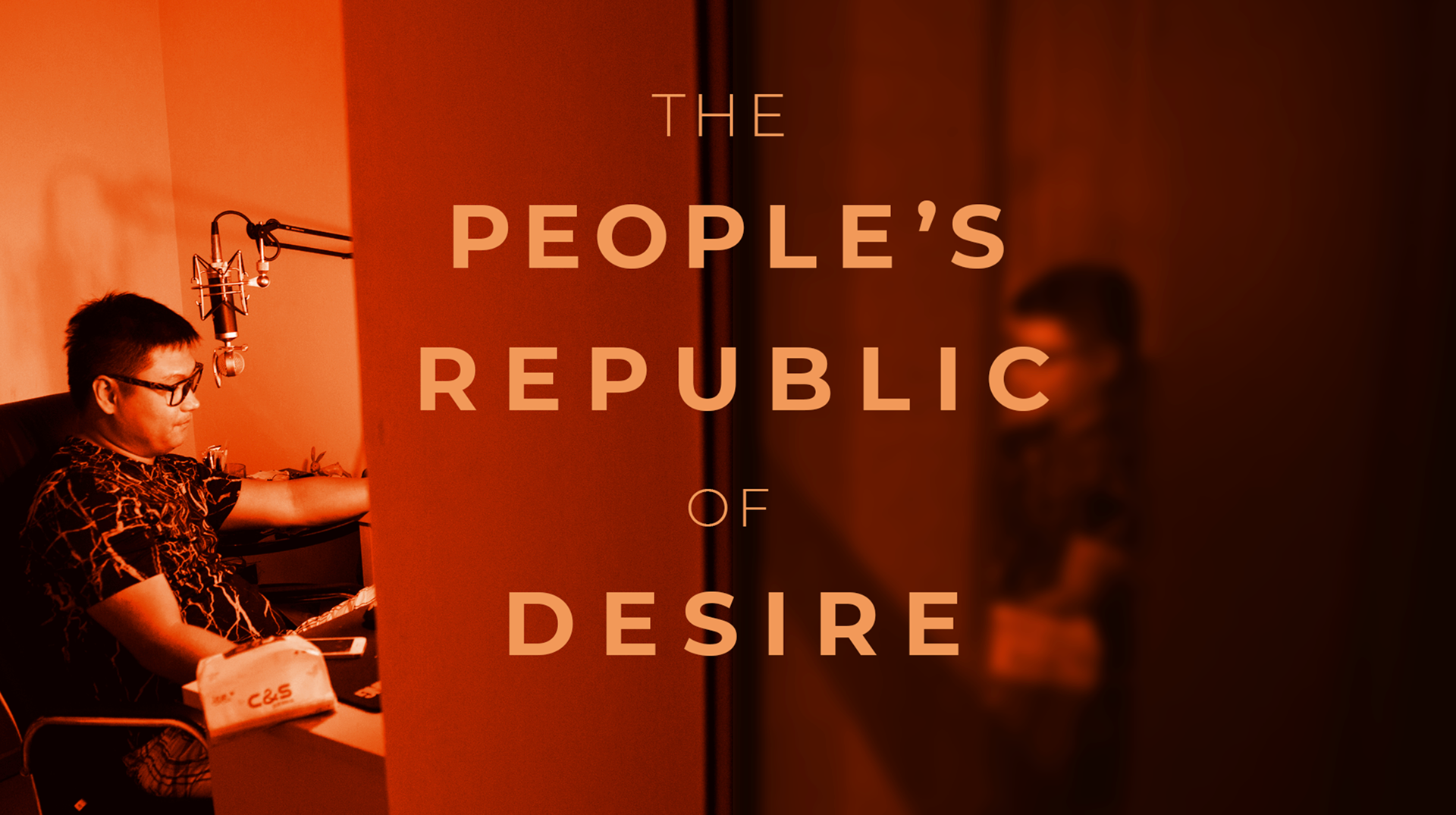
When I first set out to design this campaign, I started with type layouts and color. Maybe each film can have similar text layouts but different colors? In keeping with the IL brand, I incorporated the diagonal. I also wanted to try mirror images of the people in the design, using a happy image then an opposing sad image.
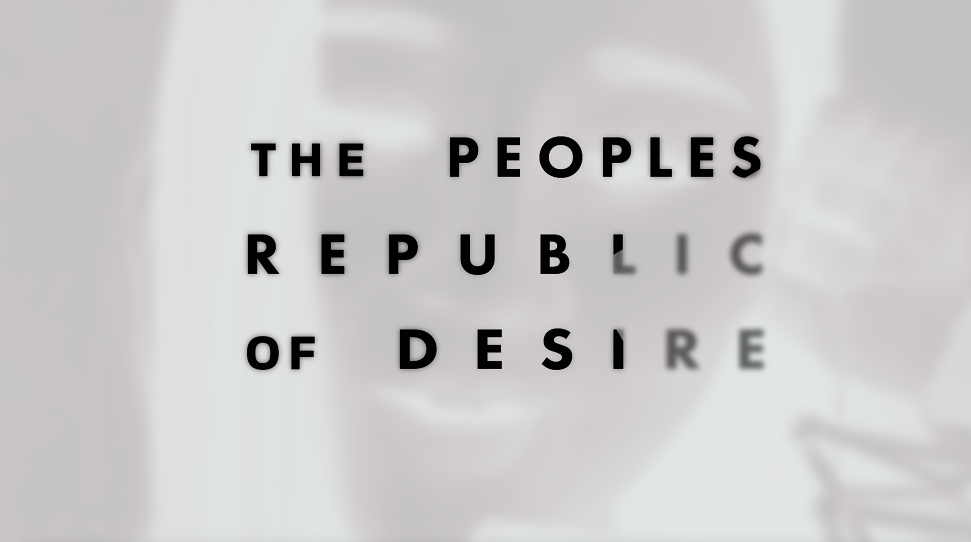
BLUE INK KALEIDOSCOPE
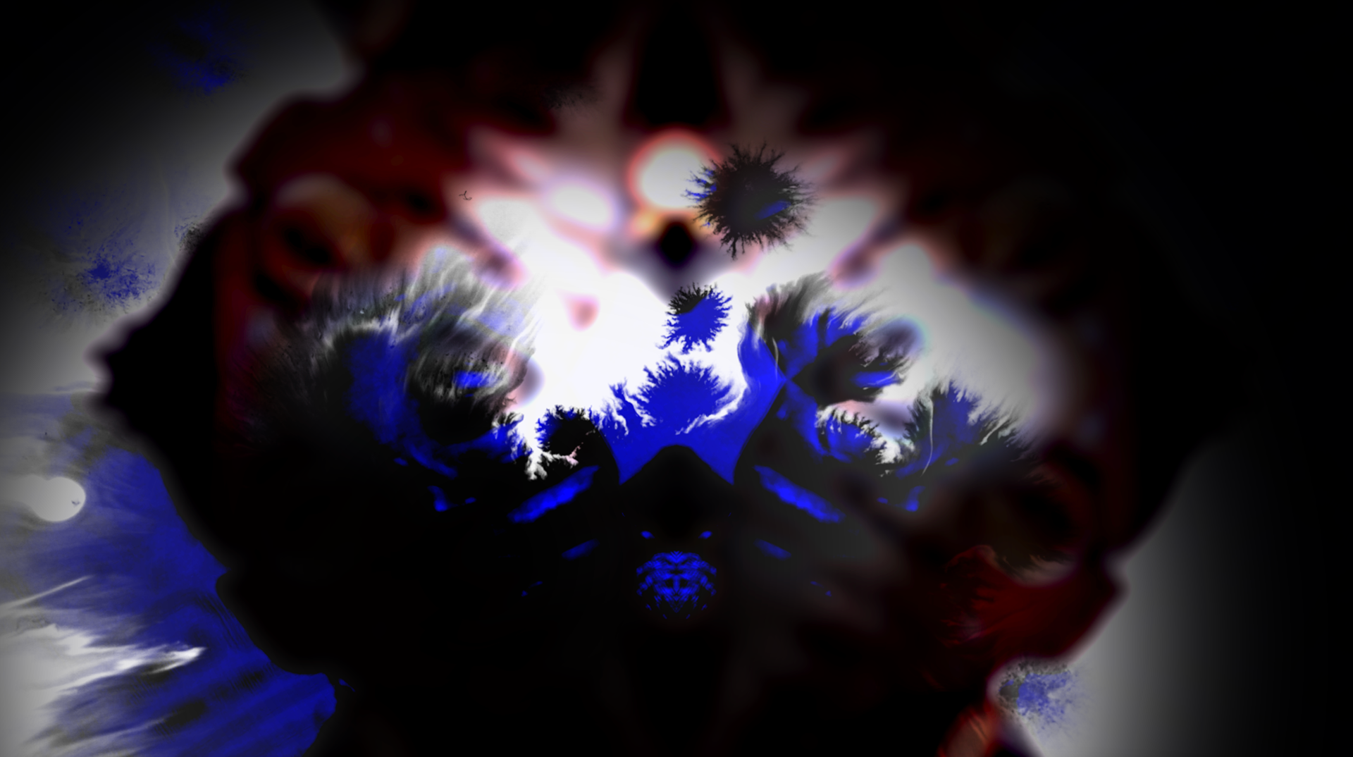
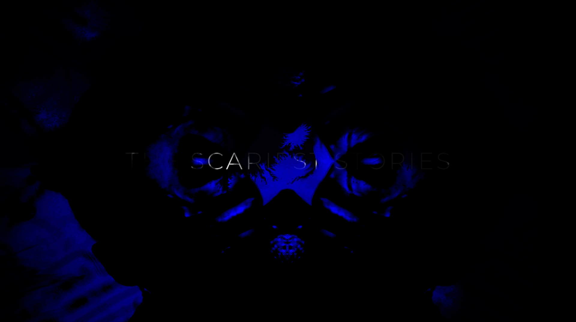
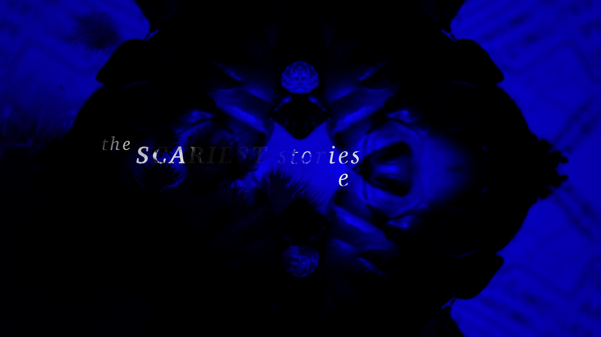
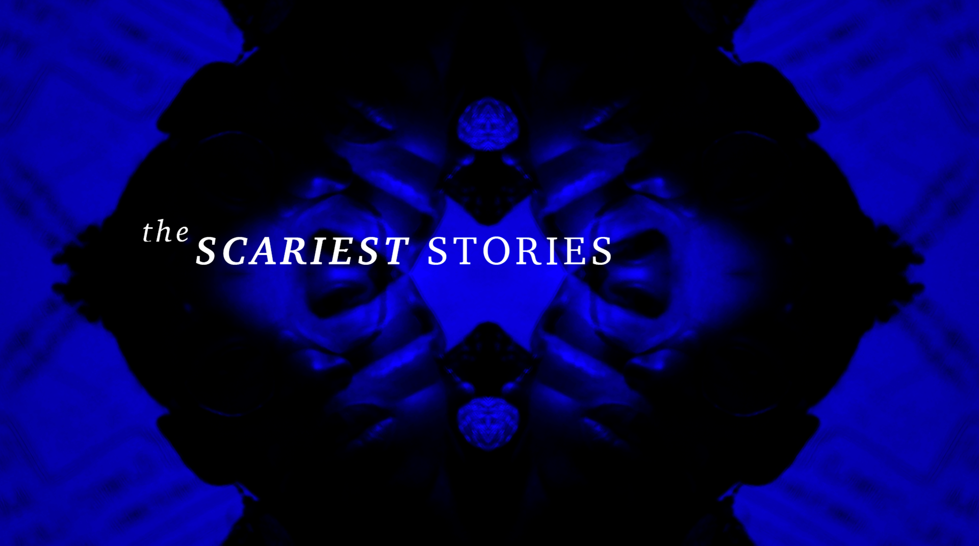
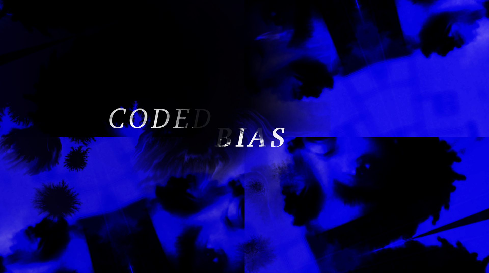
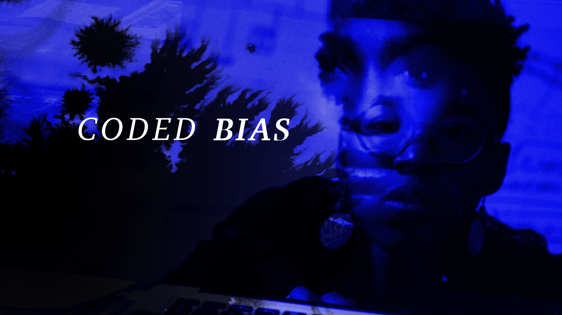
My next direction explored using a kaliedscope and ink mattes. The idea with this design is the kaleidoscope would resolve to show the background image while the ink animation would reveal the text.
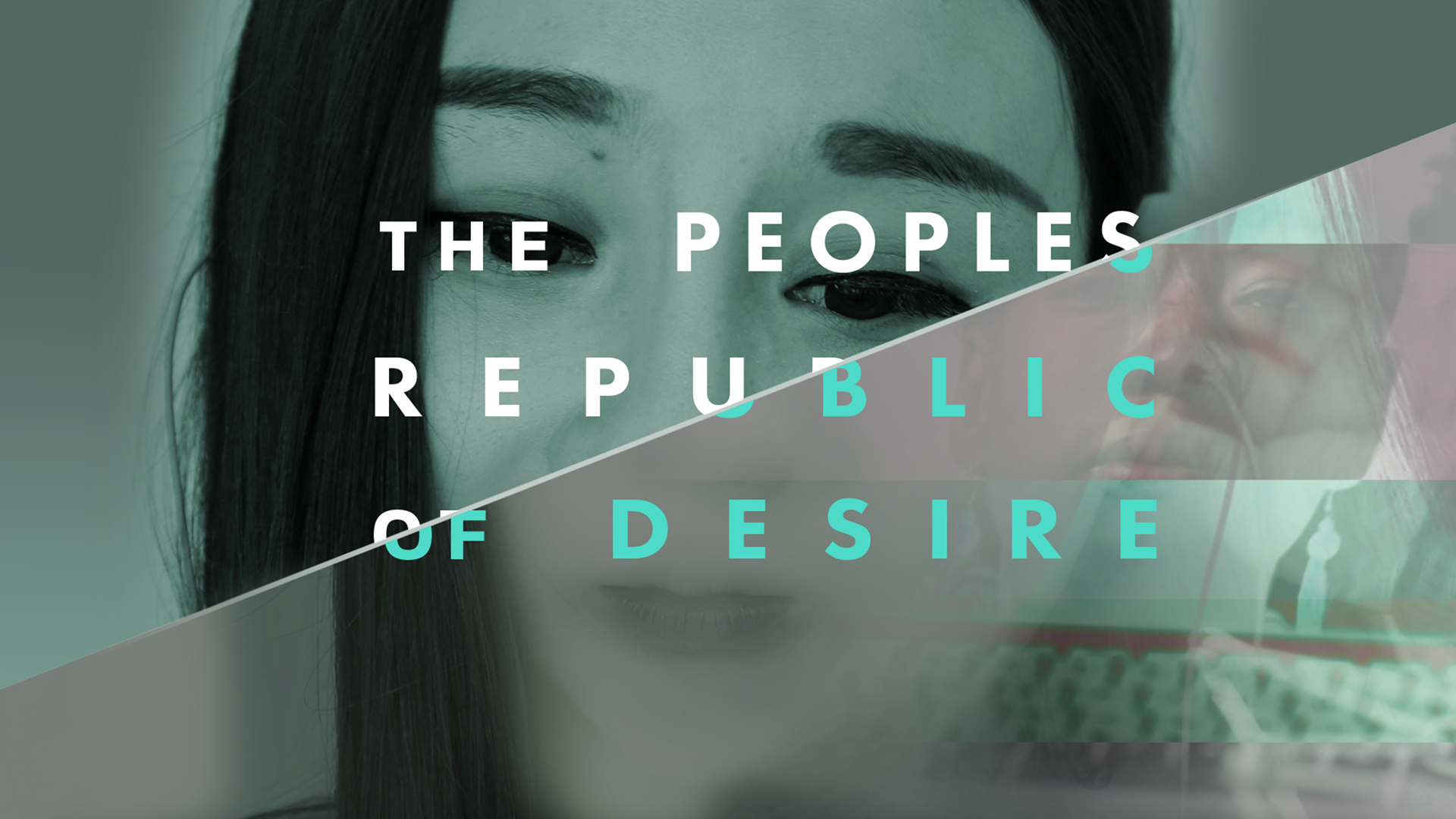
GLITCH
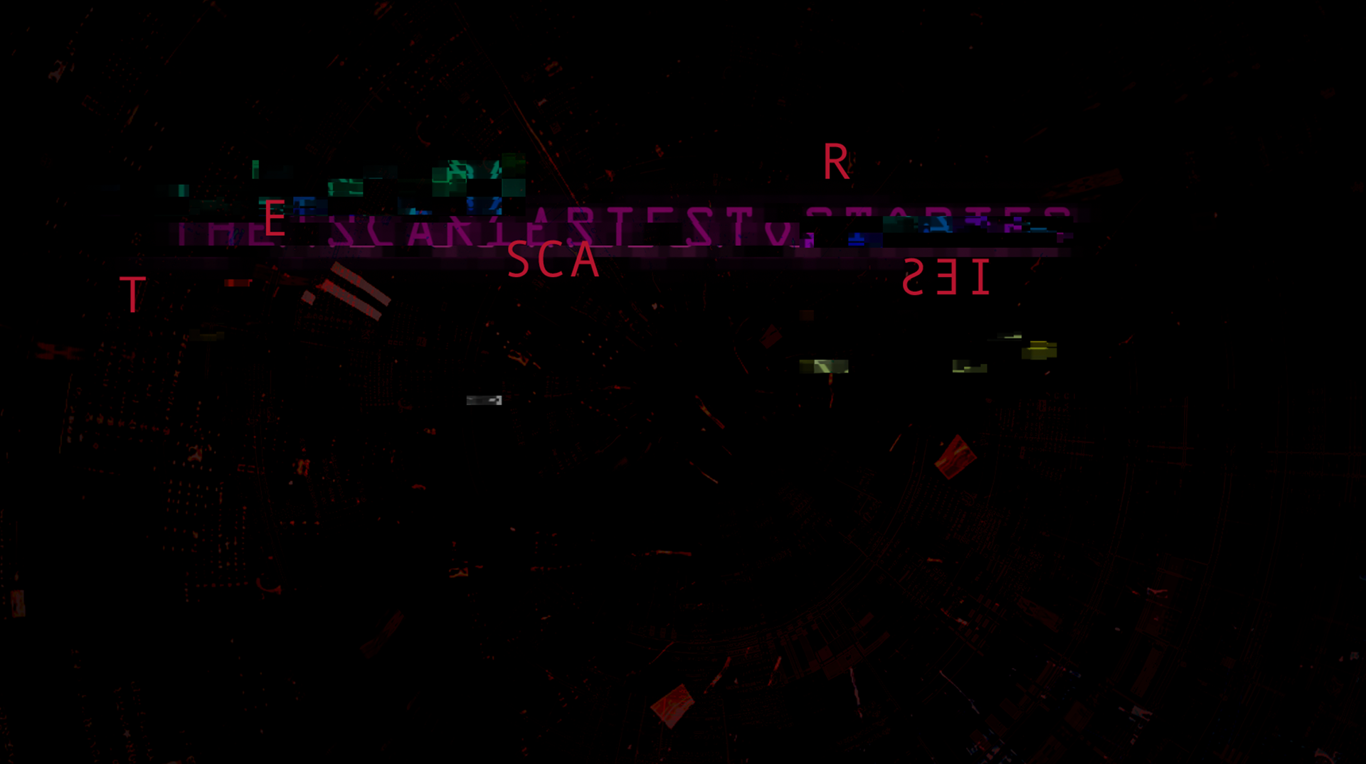
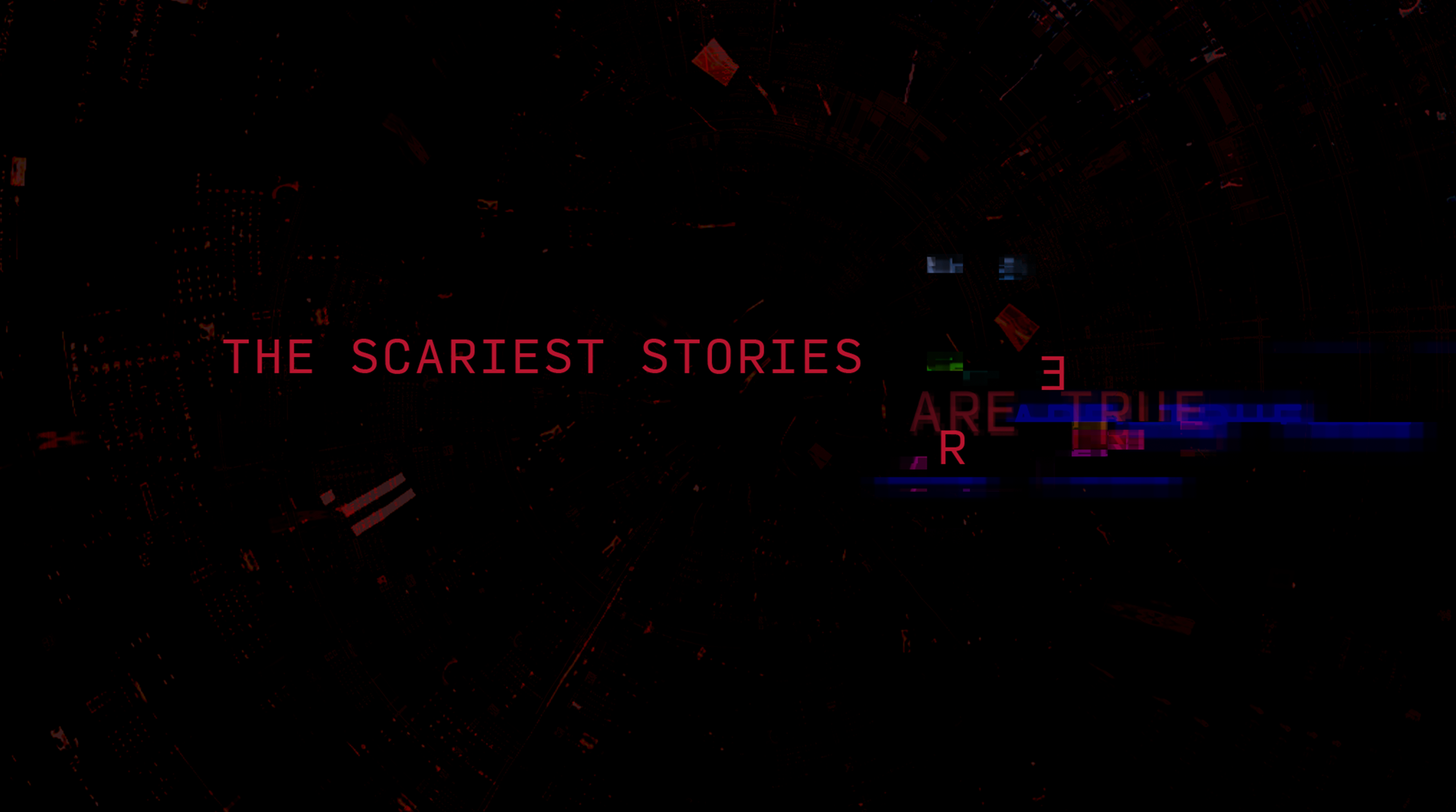
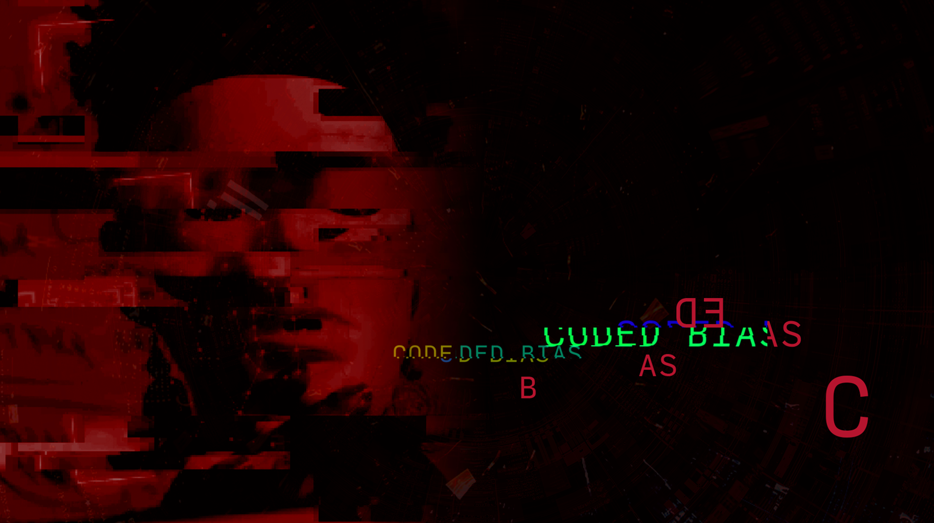
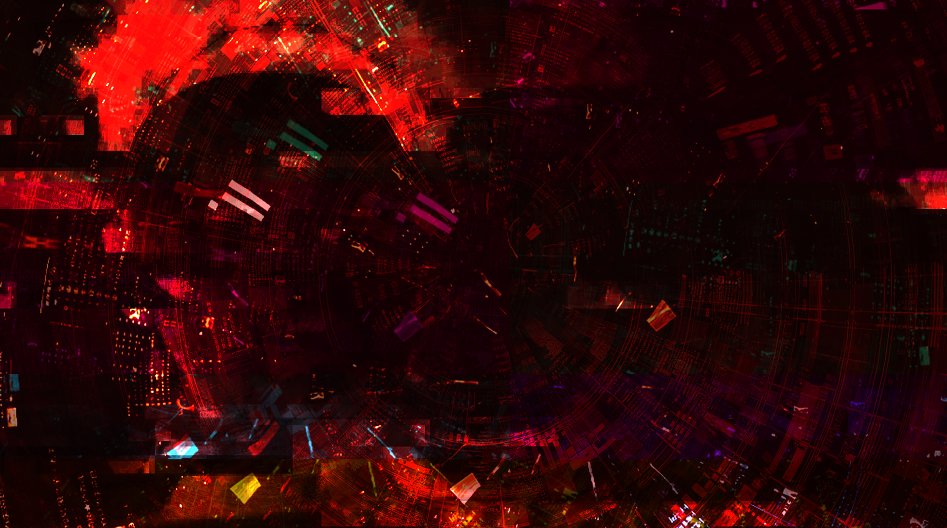
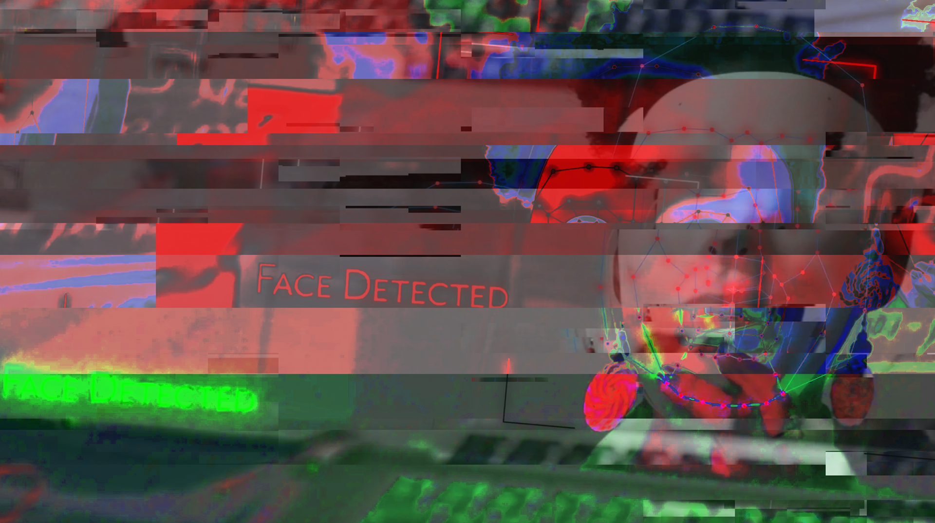
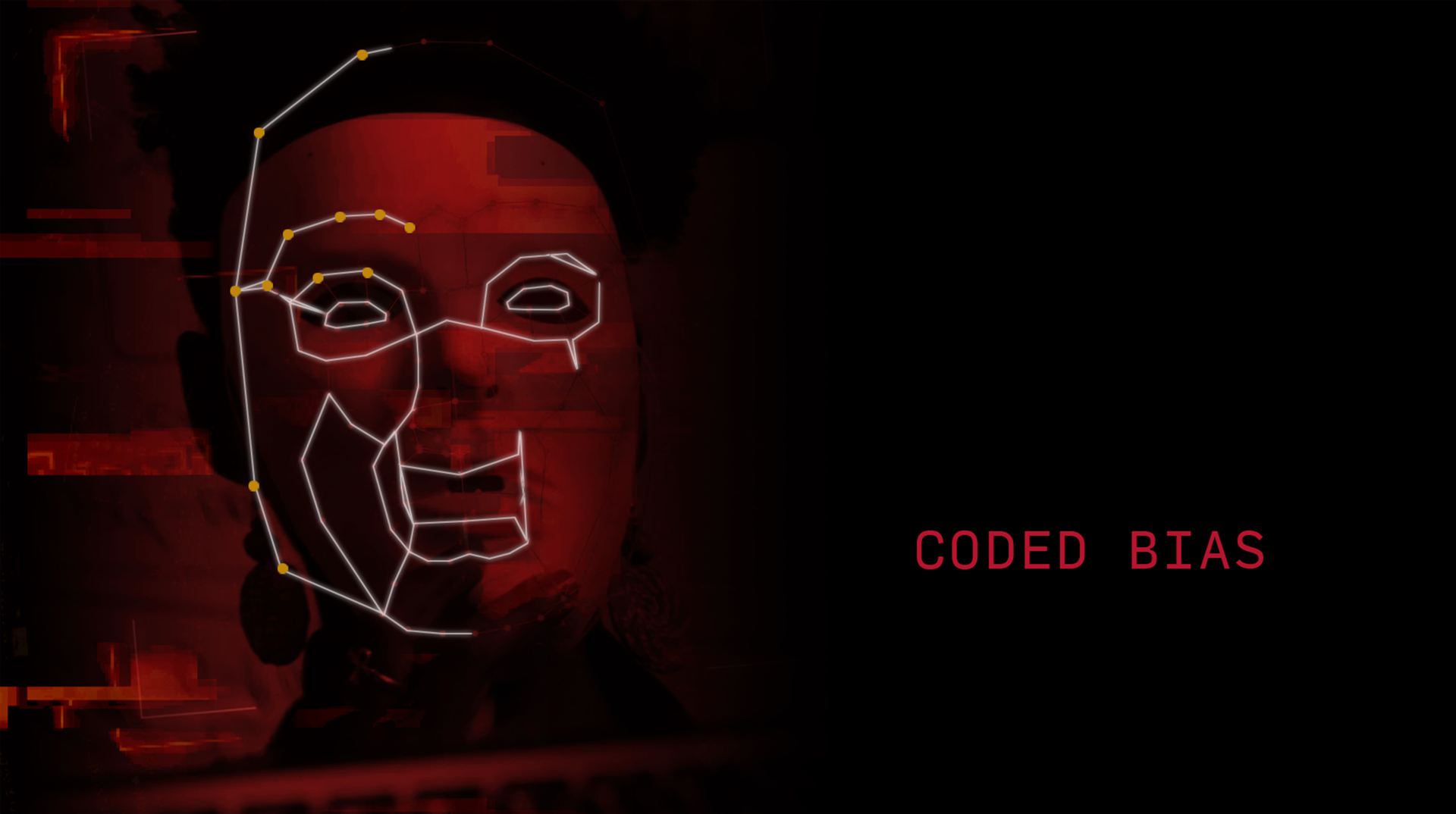
My final direction took on a glitch animation. Since the idea behind this campaign is based on technology, glitching seemed appropriate. I went with a black background and used bright, electronic colors. I sought out images from the films that could glitch then resolve. I used Maxon's Universe Glitch effect to achieve the look. The marketing team went with this direction in the end. The glitch effect fit in well with script and the idea was perfect.
PROMO
My final direction took on a glitch animation. Since the idea behind this campaign is based on technology, glitching seemed appropriate. I went with a black background and used bright, electronic colors. I sought out images from the films that could glitch then resolve. I used Maxon's Universe Glitch effect to achieve the look. The marketing team went with this direction in the end. The glitch effect fit in well with script and the idea was perfect.
SOCIAL MEDIA
For the social media for this particular campaign, I wanted to do something that distinct yet kept with the messaging of the dangers of the various technologies and apps we use daily. I came back to my original idea of opposing images.